Dec 19, 2010

SILK SCREENED PLAYING CARDS


This was the final project I designed for my Intro. to Silkscreening course. I designed and silk screened 3 full decks, all four suits, three color, and jokers. I was inspired by Fraktur Mon Amor, an amazing book I stumbled upon in one of my favorite San Francisco bookstores. I decided to use the same approach as the book and created my own designs and patterns using a blackletter typeface. I used the typeface for the numbers, A,K,Q,J, as well as any graphical pattern seen both on the box and the cards. I designed the symbols for each suit myself. Here is a small documentation of the process.


The face of the cards were 2 color. After I completed printing both colors for all the suits for each deck I planned to make, plus about another full deck extra for the mess ups, I cut them each out by hand so that I could print the backs.


After they were all cut, I printed the backs, which were 1 color. At this point I had discarded all the most tragically imperfect cards to make sure that my final 3 decks were made of the best prints, however some are slightly imperfect. I printed 156 cards that day.

After this process I rounded all the corners of the cards with a punch, and proceeded to add the last decorational and final touches by hand. Here are the final cards with a special box I made for them to live inside.

Dec 16, 2010

LOST UTOPIA

"Lost Utopia" is the title of the edition of prints I made in my Experimental Printmaking class. The concept of this print spawned from my interest in the geodesic dome both in form and theory. Because it was the final project I had more time to develop my concept over time through research and sketching. I really enjoyed learning more about Buckminster Fuller himself by watching documentaries and biographical videos about him. To hear him talk about his work and explain where it all comes from is a fascinating and extremely interesting experience and this helped inform my attitude about his influence on the world today in that it seems to have disappeared. I saw this process over time to be very...sad... especially after having felt like I was able to get to know him better through the video research I had done.


Ultimately the message of this print is about how we often get swept up in the moment of great ideas, however most fail to fully grasp the concept and therefore these ideas over time fade and become part of history because the pieces never quite fit together. The geodesic dome at that time in history was an extremely proven to be efficient use of materials, space, and money. I find the problem of space and living conditions to still be an issue today. So what happened to all Buckminster Fuller's ideas about the geodesic dome and other sustainable living structures? We forgot about them, we let them go.

The background is tiled inkjet acetate transfers. The flawed, miscalculated geodesic dome shapes were silk screened on top followed by the text.

Edition of 5

BUTTON DAY AT OTIS

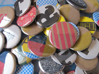
A few weeks ago around Thanksgiving the AIGA Otis student chapter hosted a Button Day event for all those involved. Here are some of the pins I made that day using scrap paper from test prints for some printmaking projects, scrap paper from school event fliers and some patterned paper. Here are the ones I kept for myself, all the rest were donated for our OTIS AIGA table at the OTIS Holiday Sale.

Dec 3, 2010

IDEAS notebook at Poketo.com!

Check out the IDEAS notebook I designed while interning at Poketo.com! The notebook was part of a gift bag given out at a recent TEDWomen conference and is also sold at Poketo.com. Have a peek around the site, you'll find lots of great stuff.


Nov 21, 2010

MAHGEETAH SHOW POSTER: DECEMBER 8TH

A poster for Mahgeetah. If you're in the bay area December 8th, I suggest checking out their show. Definitely worth catching.

Nov 4, 2010

BLACKLETTER EXPLORATIONS

I'm setting out on a mission to design and silkscreen a limited edition card deck. I was inspired when I stumbled upon and purchased Fraktur mon Amour. I am gravitated towards to beauty of the blackletter typefaces illustrated in the experimentation between the form of the letterform and the patterns it can make when abstracted. Beautiful results in my opinion. Here are some of the explorations I've done so far. I've chosen to approach the image making in the same way the book does. I am using one of the typefaces and exploring what patterns and images I can make when I begin to abstract them and explore their decorative beauty.

WALLPAPER IN ACTION

The final wallpaper hanging in the hallway of our lab area. Overall success :)


Oct 22, 2010

WHEN YOU'RE NOT AROUND


My latest submission to Mechanism of Minds. The theme for this week was obsession.
ch-ch-ch-check it.

Oct 19, 2010

LAYERs 3 & 4: BAAALLLIIIINNNNN!!!!


Layers three and four, another success. One more color to print!

Oct 18, 2010

LAYER 2! SUCCESS ... FOR THE MOST PART!

Printed my second color today. For the most part I could register them pretty close, I'm hoping for the best when I print my next three colors, but so far so good.

Oct 16, 2010

A SLOW START

I started to print my wallpaper today!! So far I've only printed one color, three more to go!

Oct 13, 2010

LIFE AQUATIC INSPIRED PATTERN

My current screenprinting assignment is to create a wallpaper based on a song. I chose Ping Island Lightning Strike Rescue Op from The Life Aquatic with Team Zissou. Here is what I have come up with so far for the pattern. Hoping to start the printing process soon!!

Oct 2, 2010

MY FIRST SILKSCREEN EDITION

The theme of the assignment was Beginnings and Endings. I chose a lyric from an Of Montreal song "our particles are in motion" to represent the idea that we are always changing, and constantly in transformation and movement. I wanted to layer into this concept it's relationship to our solar system and how it as well is constantly moving and revolving, and how this system reveals time as we experience it. The background image is an image of particles, and I added the planets as a hand drawn element burned onto my screen. It was so exciting to see it all come together.


The edition is mixed of two variations. I noticed that the fluorescent pink showed up better when printed over a lighter color, and gave more of a pop, so for the second half of the printing process I printed the planets in a lighter color and then went over and offset it in fluorescent pink to add depth and suggest slight shift or movement.

Sep 21, 2010

STYLE DOES NOT EQUAL FART

These are the final prints I made in my Experimental Printmaking Processes class this week. I chose to address the importance of style in contemporary graphic design in discussion with the Modernist/ International style. I fixated on Sagmeister's statement that Style=Fart and decided to change that expression into one that celebrates style instead.

I experimented with screen printing with different types of stencils and letting the ink flow where it may without any stencils. I also layered in some spray paint to add some bright color and texture. I burned all the typographic elements on a screen and printed them so that they had a hard edge and were more graphic than the other elements on the page. Interesting results, however I think I was successful in expressing my ideas about style.


Sep 19, 2010

DISPLAY

I stumbled upon a site with a rich selection of graphic design history featuring great book and poster designs. The site is called DISPLAY. Here are a few I found especially intriguing:


Sep 15, 2010

DECONSTRUCT // RECONSTRUCT : PACKAGE PROJECT

For this project, we were asked to take a package of your choice and then deconstruct it to reconstruct it into a new packaging design or branding. Using only the visual and typographic elements from the packaging, I decided to take Kleenex brand tissue packaging into a branding of LSD. It was a quick image making project (2 hours) to rearrange existing elements to mean something new. Here are the results:


Sep 10, 2010

AIGA RECRUITMENT POSTER


A collaborative project with Robyn Baker. The poster is a recruitment poster for the AIGA student chapter at Otis.

SCREEN PRINTING TRIALS

YAAAAYY!!! I'm still working on these, but on they're way to completion. For this project I'm trying to talk about style, and how things can "be pretty and be smart too". I challenge Stefan Sagmeister's claim that Style=Fart. My motive has no intention of downplaying a great and influential designer, but to simply question the statement as it stands on its own. Is style important? Should we care about style? Why do we associate pleasure with evil? Can't we learn and receive information and be visually satisfied at the same time? I still need to add a few more stencils and eventually type, which makes the statement: Style does not equal Fart. Will be posting the final results soon.

SAN FRANCISCO TRIP

I was in San Francisco labor day weekend and was able to catch the SFMOMA's 75th anniversary show. Lots of cool stuff, here are some images.