Feb 9, 2011
Feb 6, 2011
EXPLORATIOLNS IN IMAGE MAKING : THE BEGINNINGS

The beginning explorations for a project about how I understand my cultural heritage as most of my interactions with it seem fragmented and fantasized within my past and memories. My depictions of my Asian relatives, particularly my great aunt and grandma and my experiences with them, and therefore my experiences with Japanese culture, however far removed from Japan itself. How does this influence me and inform my identity?
So far this is an image made to explain my interpretation of my great aunt Satoko. The green color for a faint memory of her old room, her never failing ability to wish those around her good luck and happiness even when her life has brought her much pain and injustice. Her ability to remain happy and peaceful throughout all the turmoil brought on by relocation to the US during WWII and the life it left her to lead once released with no job or home working job to job from factories to strawberry fields.
Jan 30, 2011


Jan 11, 2011
MAHGEETAH STICKERS
Fresh from the printer.

New Mahgeetah stickers available at their next show in San Francisco on the 16th.
3" x 3", 250

New Mahgeetah stickers available at their next show in San Francisco on the 16th.
3" x 3", 250
Dec 19, 2010
SILK SCREENED PLAYING CARDS

This was the final project I designed for my Intro. to Silkscreening course. I designed and silk screened 3 full decks, all four suits, three color, and jokers. I was inspired by Fraktur Mon Amor, an amazing book I stumbled upon in one of my favorite San Francisco bookstores. I decided to use the same approach as the book and created my own designs and patterns using a blackletter typeface. I used the typeface for the numbers, A,K,Q,J, as well as any graphical pattern seen both on the box and the cards. I designed the symbols for each suit myself. Here is a small documentation of the process.

The face of the cards were 2 color. After I completed printing both colors for all the suits for each deck I planned to make, plus about another full deck extra for the mess ups, I cut them each out by hand so that I could print the backs.

After they were all cut, I printed the backs, which were 1 color. At this point I had discarded all the most tragically imperfect cards to make sure that my final 3 decks were made of the best prints, however some are slightly imperfect. I printed 156 cards that day.
After this process I rounded all the corners of the cards with a punch, and proceeded to add the last decorational and final touches by hand. Here are the final cards with a special box I made for them to live inside.
Dec 16, 2010
LOST UTOPIA
 "Lost Utopia" is the title of the edition of prints I made in my Experimental Printmaking class. The concept of this print spawned from my interest in the geodesic dome both in form and theory. Because it was the final project I had more time to develop my concept over time through research and sketching. I really enjoyed learning more about Buckminster Fuller himself by watching documentaries and biographical videos about him. To hear him talk about his work and explain where it all comes from is a fascinating and extremely interesting experience and this helped inform my attitude about his influence on the world today in that it seems to have disappeared. I saw this process over time to be very...sad... especially after having felt like I was able to get to know him better through the video research I had done.
Ultimately the message of this print is about how we often get swept up in the moment of great ideas, however most fail to fully grasp the concept and therefore these ideas over time fade and become part of history because the pieces never quite fit together. The geodesic dome at that time in history was an extremely proven to be efficient use of materials, space, and money. I find the problem of space and living conditions to still be an issue today. So what happened to all Buckminster Fuller's ideas about the geodesic dome and other sustainable living structures? We forgot about them, we let them go.
 The background is tiled inkjet acetate transfers. The flawed, miscalculated geodesic dome shapes were silk screened on top followed by the text.
Edition of 5
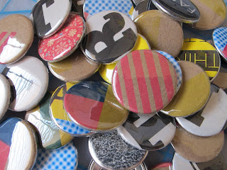
BUTTON DAY AT OTIS
A few weeks ago around Thanksgiving the AIGA Otis student chapter hosted a Button Day event for all those involved. Here are some of the pins I made that day using scrap paper from test prints for some printmaking projects, scrap paper from school event fliers and some patterned paper. Here are the ones I kept for myself, all the rest were donated for our OTIS AIGA table at the OTIS Holiday Sale.

Dec 3, 2010
IDEAS notebook at Poketo.com!
Check out the IDEAS notebook I designed while interning at Poketo.com! The notebook was part of a gift bag given out at a recent TEDWomen conference and is also sold at Poketo.com. Have a peek around the site, you'll find lots of great stuff.


Nov 21, 2010
MAHGEETAH SHOW POSTER: DECEMBER 8TH
 A poster for Mahgeetah. If you're in the bay area December 8th, I suggest checking out their show. Definitely worth catching.
Nov 4, 2010
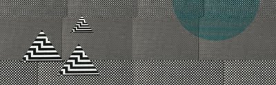
BLACKLETTER EXPLORATIONS
I'm setting out on a mission to design and silkscreen a limited edition card deck. I was inspired when I stumbled upon and purchased Fraktur mon Amour. I am gravitated towards to beauty of the blackletter typefaces illustrated in the experimentation between the form of the letterform and the patterns it can make when abstracted. Beautiful results in my opinion. Here are some of the explorations I've done so far. I've chosen to approach the image making in the same way the book does. I am using one of the typefaces and exploring what patterns and images I can make when I begin to abstract them and explore their decorative beauty.


Subscribe to:
Posts (Atom)
