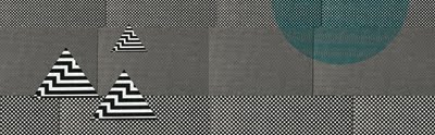
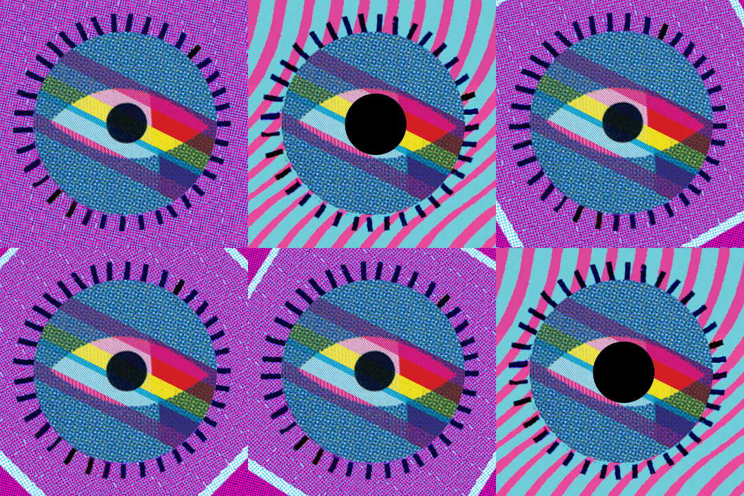
The final wallpaper hanging in the hallway of our lab area. Overall success :)
Nov 4, 2010
Oct 22, 2010
WHEN YOU'RE NOT AROUND

My latest submission to Mechanism of Minds. The theme for this week was obsession.
ch-ch-ch-check it.
Oct 21, 2010
Oct 19, 2010
Oct 18, 2010
LAYER 2! SUCCESS ... FOR THE MOST PART!
Oct 16, 2010
Oct 13, 2010
LIFE AQUATIC INSPIRED PATTERN
Oct 2, 2010
MY FIRST SILKSCREEN EDITION
The theme of the assignment was Beginnings and Endings. I chose a lyric from an Of Montreal song "our particles are in motion" to represent the idea that we are always changing, and constantly in transformation and movement. I wanted to layer into this concept it's relationship to our solar system and how it as well is constantly moving and revolving, and how this system reveals time as we experience it. The background image is an image of particles, and I added the planets as a hand drawn element burned onto my screen. It was so exciting to see it all come together.


The edition is mixed of two variations. I noticed that the fluorescent pink showed up better when printed over a lighter color, and gave more of a pop, so for the second half of the printing process I printed the planets in a lighter color and then went over and offset it in fluorescent pink to add depth and suggest slight shift or movement.
Sep 21, 2010
STYLE DOES NOT EQUAL FART
These are the final prints I made in my Experimental Printmaking Processes class this week. I chose to address the importance of style in contemporary graphic design in discussion with the Modernist/ International style. I fixated on Sagmeister's statement that Style=Fart and decided to change that expression into one that celebrates style instead.
I experimented with screen printing with different types of stencils and letting the ink flow where it may without any stencils. I also layered in some spray paint to add some bright color and texture. I burned all the typographic elements on a screen and printed them so that they had a hard edge and were more graphic than the other elements on the page. Interesting results, however I think I was successful in expressing my ideas about style.


I experimented with screen printing with different types of stencils and letting the ink flow where it may without any stencils. I also layered in some spray paint to add some bright color and texture. I burned all the typographic elements on a screen and printed them so that they had a hard edge and were more graphic than the other elements on the page. Interesting results, however I think I was successful in expressing my ideas about style.


Sep 20, 2010
Subscribe to:
Posts (Atom)