Oct 2, 2010

MY FIRST SILKSCREEN EDITION

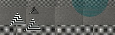
The theme of the assignment was Beginnings and Endings. I chose a lyric from an Of Montreal song "our particles are in motion" to represent the idea that we are always changing, and constantly in transformation and movement. I wanted to layer into this concept it's relationship to our solar system and how it as well is constantly moving and revolving, and how this system reveals time as we experience it. The background image is an image of particles, and I added the planets as a hand drawn element burned onto my screen. It was so exciting to see it all come together.


The edition is mixed of two variations. I noticed that the fluorescent pink showed up better when printed over a lighter color, and gave more of a pop, so for the second half of the printing process I printed the planets in a lighter color and then went over and offset it in fluorescent pink to add depth and suggest slight shift or movement.

Sep 21, 2010

STYLE DOES NOT EQUAL FART

These are the final prints I made in my Experimental Printmaking Processes class this week. I chose to address the importance of style in contemporary graphic design in discussion with the Modernist/ International style. I fixated on Sagmeister's statement that Style=Fart and decided to change that expression into one that celebrates style instead.

I experimented with screen printing with different types of stencils and letting the ink flow where it may without any stencils. I also layered in some spray paint to add some bright color and texture. I burned all the typographic elements on a screen and printed them so that they had a hard edge and were more graphic than the other elements on the page. Interesting results, however I think I was successful in expressing my ideas about style.


Sep 19, 2010

DISPLAY

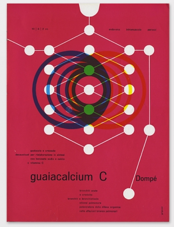
I stumbled upon a site with a rich selection of graphic design history featuring great book and poster designs. The site is called DISPLAY. Here are a few I found especially intriguing:


Sep 15, 2010

DECONSTRUCT // RECONSTRUCT : PACKAGE PROJECT

For this project, we were asked to take a package of your choice and then deconstruct it to reconstruct it into a new packaging design or branding. Using only the visual and typographic elements from the packaging, I decided to take Kleenex brand tissue packaging into a branding of LSD. It was a quick image making project (2 hours) to rearrange existing elements to mean something new. Here are the results:


Sep 10, 2010

AIGA RECRUITMENT POSTER


A collaborative project with Robyn Baker. The poster is a recruitment poster for the AIGA student chapter at Otis.

SCREEN PRINTING TRIALS

YAAAAYY!!! I'm still working on these, but on they're way to completion. For this project I'm trying to talk about style, and how things can "be pretty and be smart too". I challenge Stefan Sagmeister's claim that Style=Fart. My motive has no intention of downplaying a great and influential designer, but to simply question the statement as it stands on its own. Is style important? Should we care about style? Why do we associate pleasure with evil? Can't we learn and receive information and be visually satisfied at the same time? I still need to add a few more stencils and eventually type, which makes the statement: Style does not equal Fart. Will be posting the final results soon.
SAN FRANCISCO TRIP

I was in San Francisco labor day weekend and was able to catch the SFMOMA's 75th anniversary show. Lots of cool stuff, here are some images.


Sep 9, 2010

DRESS MAKEOVER

This was a quick project completed during my Advanced Image Making class this week. We were given very out of date dresses and were told to make them "modern". The project arose out of discussion about Modernism and modernity, and what the distinctions between the two are.


Amy, Yongmin, and I transformed the dress by taking off length, adding functionality to the dress with pockets and a feature that allowed you to change the length of the dress on the sides. We also added some new fabric, and spray painted over the original color and pattern of the dress which was absolutely hideous. I wish I had a picture of the original dress, didn't come to mind while it was all happening.

Sep 2, 2010

FINDINGS

Here are a bunch of things I've piled into my "i like" folder on my desktop. They are the things that I see while surfing this ever expanding web. They are things that make me excited about design.